The John Edwards Esquire Cover:
Getting That "Come Hither" Look
to Sell Your "Book."
As some of my readers and all of my detractors know I spent many years as an editor for Penthouse Magazine. I worked for it when it sold in the millions and I worked for it when it sold, as it does today, in the hundreds of thousands. You might have your fantasies about what it was like to work for the magazine and while most are false, some are true. But those stories are for another time. Today's tale is about how professional men's magazine editors work up the magazine's most important page, the cover.
It's a popular bromide that "You can't judge a book (or magazine) by its cover." While that's true enough in terms of final judgement, it's also true that "If you can't judge a book (or magazine) by its cover, what reason do you have for buying it?"
A lot of work and (mostly misplaced) thought goes into the making of a magazine cover. Indeed it is over-thought most times and ends up, today, being the compromise solution for a number of vested interests inside the magazine -- the publisher, the editor, the circulation manager, the head of advertising, and the art director, to name the most prominent, but not all of the folks that have a "vote" on what goes on the cover. The cover is important not just because it covers the issue, but even more because the cover powers the most crucial portion of the magazine's business effort, "news stand circulation."
It is obvious that circulation is key to a magazine's success because the more copies you sell to your target demographic, the more advertisers will buy pages in your "book" (Magazine folks call their magazine "the book.) In addition, the more copies you sell the higher your price for an ad page can be. Circulation up, ad revenue up. Circulation down, revenue plummets. The cover price is important too, but not nearly as important as the ad revenue. Indeed, since the publisher receives on average less than half the cover price when a news stand sale occurs and much less than the cover price on a cut-rate subscription, the ad revenue is where -- for most magazines -- the lion's share of the revenue originates.
There are two main components to a magazine's circulation, subscription and news stand. Subscription revenue brings the magazine most of its base rate in that the number of subscribers is, for most magazines, the most constant part of the circulation. Those doctors' waiting rooms are very important for magazines, even more these days until internet browsers and wifi are common in those terrible rooms.
News stand revenue is a much more important number to the media buyers at advertising agencies that actually place orders for ads in magazines. The rate of new stand sales -- individual copies sold one at a time to readers -- is thought to be a measure of how "hot" a particular magazine is at any given time. Media buyers track news stand sales carefully in deciding what magazines to include in their media buys. They want to have a reach with their ads into the subscribers, but they also want to be where the action is on the news stand. Of all the careers in media, media buying is one of the most sensitive when it comes to our common culture of cool.
The primary means of delivering news stand sales is to stimulate the passing browser in, say, an airport news stand to actually pick up the magazine and leaf through it. The tool here is the cover and only the cover. Because of this you see, in most magazines, an endless listing of cover lines -- often with numbers in them since "research" once showed that readers like to see a lot of numbers on the cover -- that tout the contents inside the magazines. Added to this welter of come-on copy written as cleverly as the talents of the editors will allow, is an image of, in the case of most magazines, a very pretty person or, better yet, a celebrity whose face people know and recognize. Slap numbers, clever copy,and celebrities together, drop in a logo and, hey, there's your standard average magazine cover of the moment. This is why so many are so boringly the same.
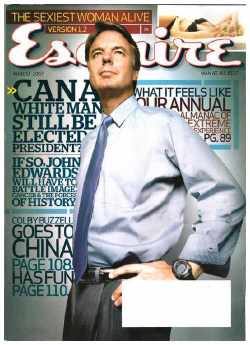
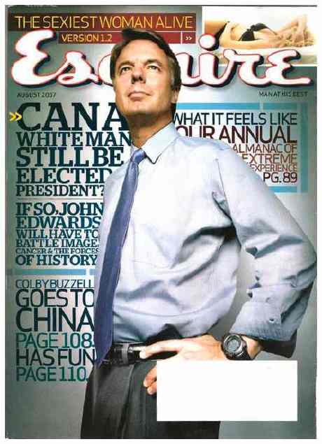
The current Esquire cover featuring John Edwards is a classic case in predictable men's magazine cover making. It looks like this:

As a magazine editor, I've got to admire that. It's got every current trick in the book, including the recently popular trick of forcing you to figure out just what a lot of the cover-lines actually say. [Upper right: "Hat It Feels Like / Nnual Lmanc of / Xtreme/ Xperience / Pg. 89" -- worked that number in, didn't they?].
Here the cover subject, John Edwards, is raised to magazine iconic status.
- Shot slightly from below for that Mount Rushmore effect.
- Cuffs rolled up once to make the hands seem larger and expose the manly wrist.
- Wrist watch is digital so you know he's down with the techno stuff.
- Three-quarter pose so he seems slimmer than he is.
- Big plunging tie package dropping just over the belt-buckle, right next to "FUN," and pointing down.
- Forefinger on the belt just so and separated from the others to enhance the impression of casual yet assured strength.
- Head raised slightly up to smooth out any hint of a double-chin and the chin itself framed with shadow to give it that jutting out Pattonesque character.
- Sober yet somehow compassionate expression and the eyes gazing off into the visionary distance.
- Studio shot against a seamless paper background.
- Given, via Photoshop I would imagine, a kind of glowing halo of light in which John Edwards stands magnificently alone, anointed with a slight sheen of makeup powder and ready for his date with destiny.
I'd say to get this shot took the following crew of people at a minimum: One photographer, two camera assistants, two make-up folks, one clothes stylist, one hair specialist, three gophers, and two of Edwards' handlers. For a man of Edwards' rank at a photo shoot there were probably more to make him feel as important as he needs to feel, but skeleton staff above could do it in a pinch.
Following the shoot we would move to the selection of the actual photograph. There were, if the photographer was doing his job, hundreds of frames taken with a large format camera -- probably a Hassleblad -- out of which one would be selected. In the case of Edwards it was most likely, although not certainly, selected with the approval of the Edwards' PR/Image machine, possibly Edwards himself. The ceding of cover photo approval to the celebrity being photographed is increasingly common in magazines today since celebrities are now much more powerful than magazines, especially one like Esquire. On the one hand, celebrities need exposure and on the other hand celebrities sell magazines. Magazines are more than ready to make the deal. Result: Odds at 80-20 that Edwards said, "My name is John Edwards and I approve of this photograph."
And then it all fell apart.
It fell apart because, as we noted above, in the magazine circulation wars, news stand sales are king and when it comes to being displayed on the news stand, positioning is key.
By positioning I mean how and where a magazine is placed on the news stand. Think about it. When you wander into a Barnes and Noble and glance at the magazine racks, do you see the entire cover for most magazines? No. You see them, in the main, racked one behind the other in the shelves. You see, at best, the top quarter of the cover unless the magazine is at the front of the shelf or stacked up on the floor shelf in a large pile. None of this is by accident. Position on news stands is not random. You get front shelf position or stacked floor position the old fashion way -- you earn it. The more copies you sell, the more the news stand orders and the better they display it. They do not, unless you pay them off, reinforce failure.
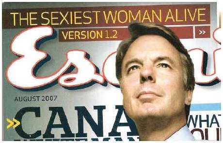
Because of this, the smaller magazines like Esquire (even if they are still thought to be "highly influential") cannot count on getting good news stand position. Instead they assume they will have poor news stand position and plan for it by slapping their best come-on above the logo and at the top of the magazine. In a magazine that is ostensibly aimed at heterosexual males that come-on will always be "sex with girls." In this case it is "The Sexiest Woman Alive / Version 1.2." Bang, zoom, right to the groin. The line screams "Choose me, choose me, you hot little stud muffin on the way to St. Louis in economy!" And they do. They do. They reach up and pull the magazine out from behind "Men's Vogue**" and slap their money down.
It's a win for Esquire, but the Edwards camp cannot be happy about it. After all, they got cover approval, an iconic shot that portrayed their candidate in the best possible, even holy, light. They thought they had it covered, but they failed to consider what happens after the image is selected and news stand position.
After the image in selected is when the cover lines go on. And after the magazine is printed is when the copies are positioned in the news stand. In this case, what most of America will see when glancing at a news stand is this:

Which cannot be at all what the Edwards campaign had in mind. Is it what Esquire had in mind? I can't say but I do know that Job One of the publisher, editor, advertising manager, circulation director, and art director of Esquire is not to elect John Edwards but to sell magazines from a poor news stand position. Here they've done it very well indeed.
** "Men's Vogue" had its way with Edwards earlier this season when it described him thus:
The hair, up close, is peppered with tiny strands of blond. Chestnut brown and so finely trimmed, mellifluous, smooth, and feathery, it could almost be a weave, the Platonic ideal as imagined by the Hair Club for Men. Along with the piercing blue eyes, slashing V-shaped smile, and a shimmering burgundy shirt tucked into stonewashed Levi's resting low on the hips, the hair completes the man: John Edwards, a populist Adonis, a golden god of a Southern Democrat.